My writing page has moved to Substack, where I’m exploring the community and sharing thoughts on design, technology, hiking, dance, and music.
Guest Lecture at Loyola Marymount University
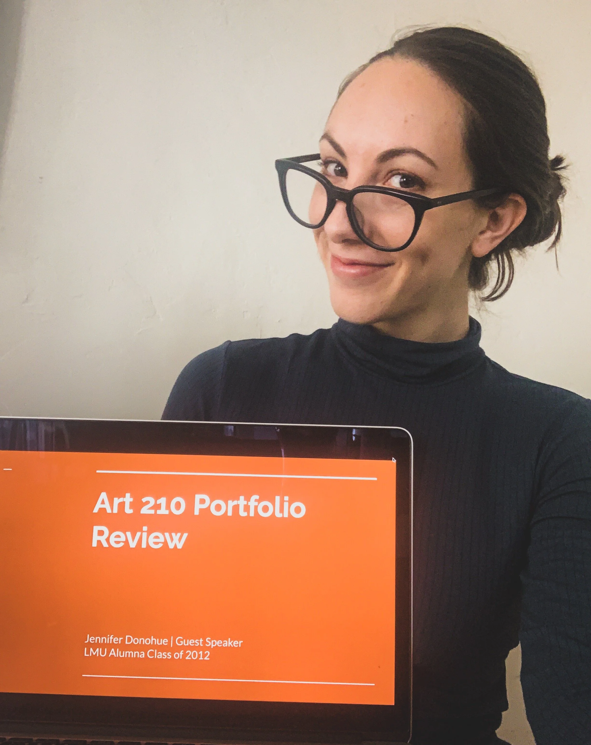
Aristotle said, “Those who know, do. Those that understand, teach.” On April 3rd, I returned to my alma matter of Loyola Marymount for my second guest lecture. The presentation covered the importance of and best practices for crafting a portfolio, resumé, and tips for writing a cover letter. Students who participated are freshman in the Studio Arts major (graphic design, fine arts, multimedia, photography) and their focus in this class is namely professional development.
The presentation also allowed for students to present their portfolios in progress for a critique where I acted as a hiring manager and pointed out the opportunities for enhancement with layout, copy, and content. This was also a great experience for students to participate in a different type of critique as the class this year has been almost entirely done through Zoom.
I am very thankful to my former Professor SaeRi Dobson for the opportunity to return and share my thoughts and expertise with the students. It is so wonderful to be in the learning environment and be of service to younger creatives.
The Persephone Project - A Zine
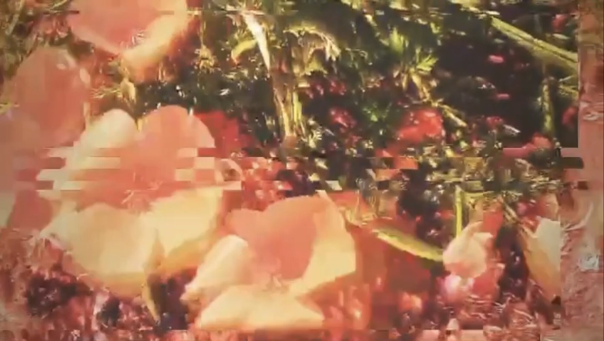
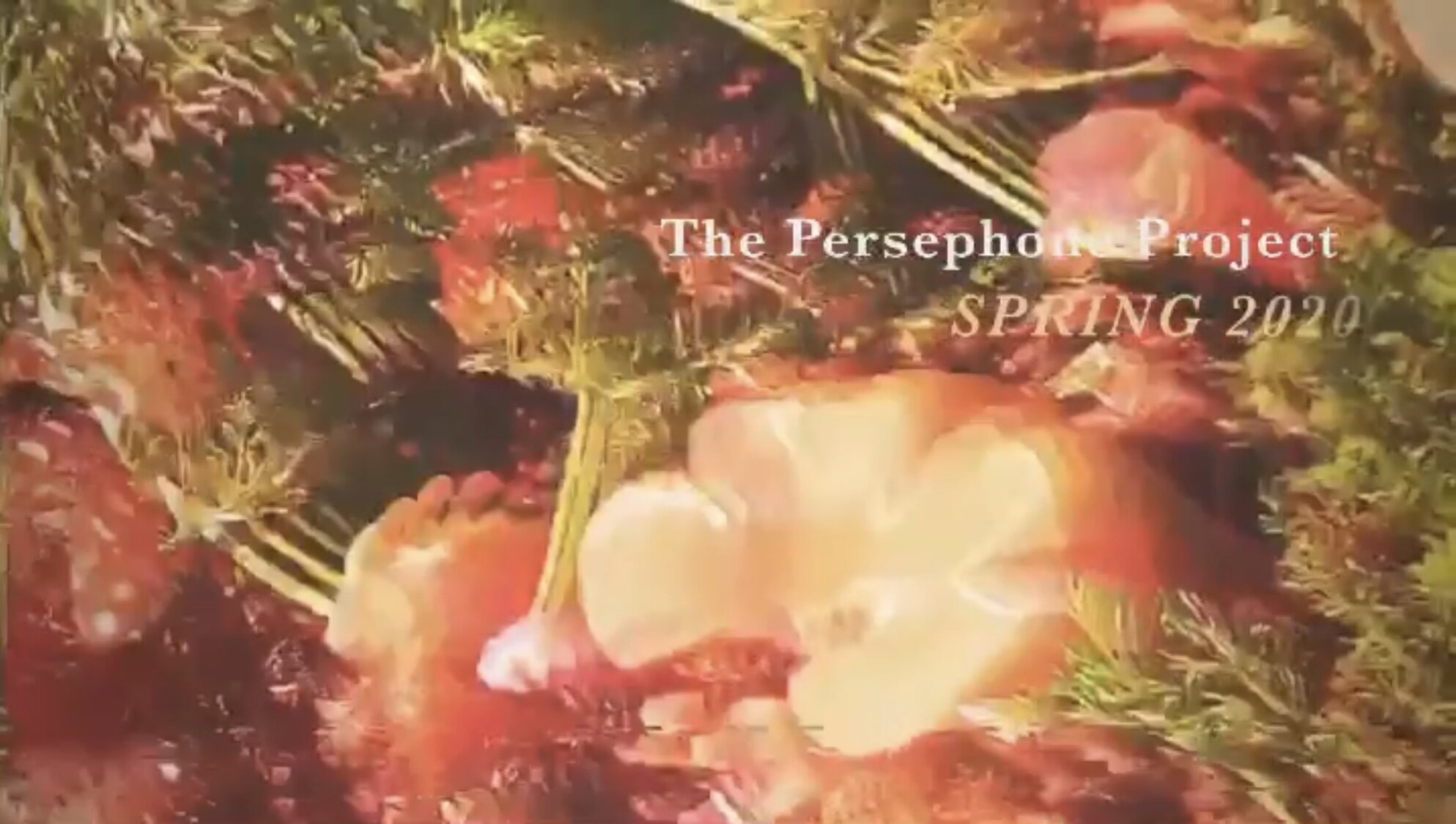
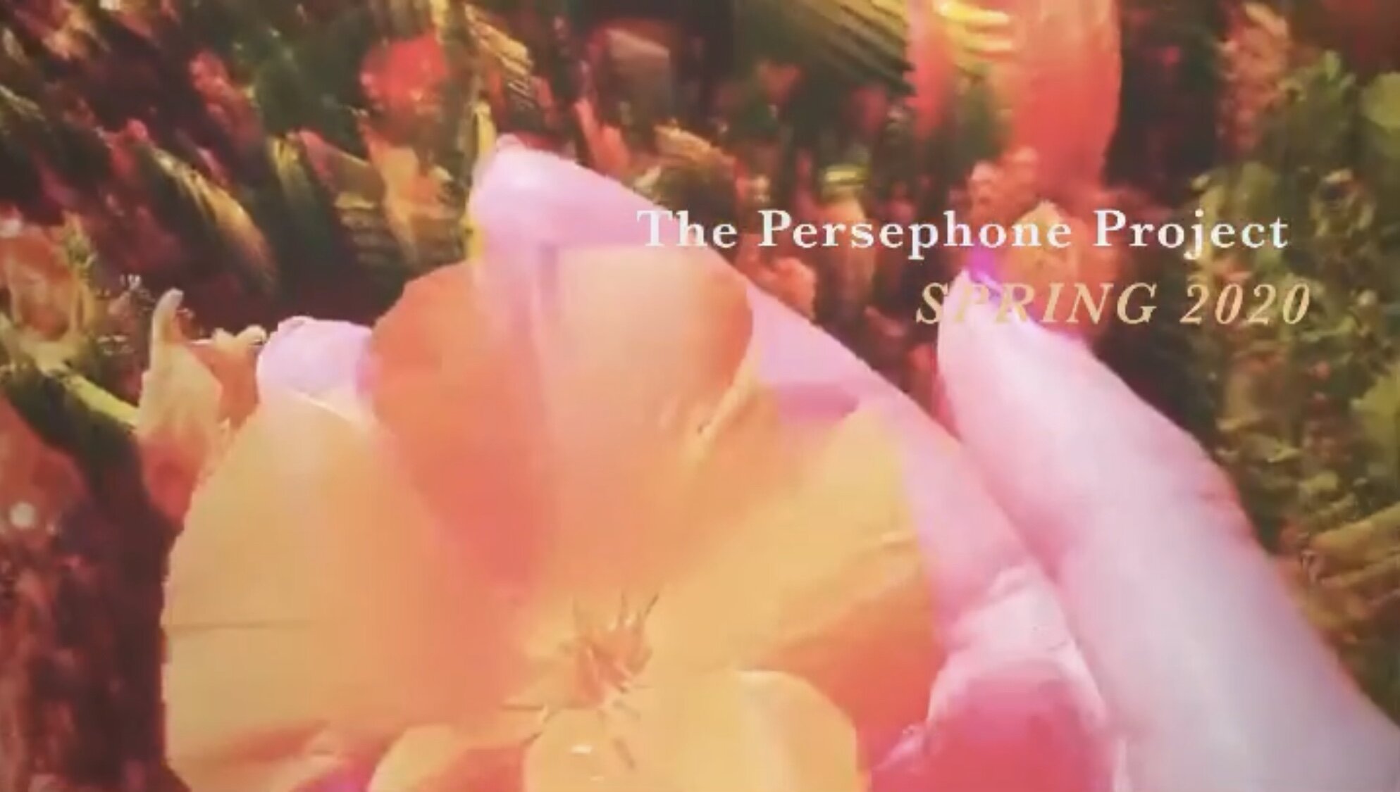
My latest creative endeavor – The Persephone Project – is an idea with its genesis during the winter months and its realization beginning at the Spring Equinox. This project brings together my creative passions in a single, tactile format of a zine. Through photography, illustration, collage, and written word, I interpret a modern take on the story of Persephone - Goddess of Spring and Queen of the Underworld. The visual narrative explores the journey of understanding the eternal balance between light and dark. 🌹🥀
A few stills from the teaser video, created in After Effects.
As this project ideation was solidifying, the state of the world was rapidly changing due to COVID-19. Like many, I found myself in a state where expressing the thoughts, emotions, etc. through a creative channel to be the most liberating and renewing. I am so grateful to be able to have the time and resources to dedicate myself almost fully to this project and find that I’ve been pouring so much soul into it. Part of this creation is to illuminate the process, not just glorifying the final work, because it’s so integral to the content. How life can change in an instant, the adaptations we must take on, the mindset to cultivate calm and strength in turbulent moments. As some say, Amor Fati.
Daily UI Challenges
The Daily UI Challenge is a great way to flex the design muscle. I'll be posting my projects here as they are completed and all can be found on my Dribbble page as well.
Daily UI Challenge 001 - Sign Up
I used the opportunity to share some of the inspiration I received walking outside the office last night. It was dusk - the sky had this beautiful teal-blue pop to it, clear as can be, the power lines and mountain in the forefront provided great contrast.
My designs lately have been in a light color scheme so I decided to also challenge myself with a dark UI. Enjoy!
Daily UI Challenge 002 - Credit Card Checkout
Going for a sleek UI and giving Android some love.
For entering the CVV, I envision the two cards swapping places so the back card is now in the foreground.
Daily UI Challenge 003 - Landing Page
In honor of my favorite band, and the fact that I just scored pre-sale tickets, here's a landing page for Depeche Mode.
What do we want? Tickets. When do we want them? Now!
Daily UI Challenge 004 - Calculator
With this challenge I wanted to create a widget that's simple and elegant using a light ui.
Daily UI Challenge 005 - App Icon
This design was inspired by the many plane flights I've been on lately. I fly on different airlines and it would be great to have a centralized app for all my rewards accounts, itineraries, etc.
On another note, it's the first app icon I've designed on a white background. Really enjoyed how the gradient in the shape turned out.
Daily UI Challenge 006 - User Profile
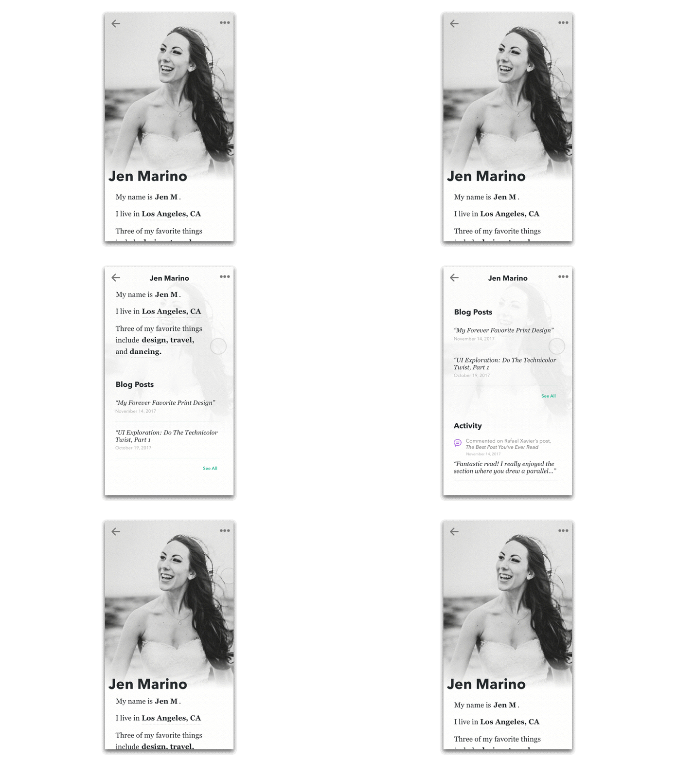
For this challenge piece, I wanted to create an animation to further show additional content as well as push myself past posting just a static image.
Overall, I wanted to design a user profile that feels more as if it's telling a story than pushing out stats. The content focuses more on the person and I feel that the typography aids in that goal.
My Forever Favorite Print Design
Three hundred sixty one days ago my morning started off in an airplane on a red eye flight to Miami. My parents, then fiancé, and I traveled to Florida for a week of preparation and relaxation (or insanity as it turned out to be) for my wedding day. As I'm musing about the time almost one year later, I wanted to think about all the details that I stressed over and wonder if it was really worth it?
Of course as a designer, I created everything that went into this event. Save the date cards, invitations, escort cards, table numbers, signage, even a custom label for cigars. Most importantly I designed the experience of the big day. Looking back on it all, memories of planning that remain with me in the forefront are those around designing our invitations.
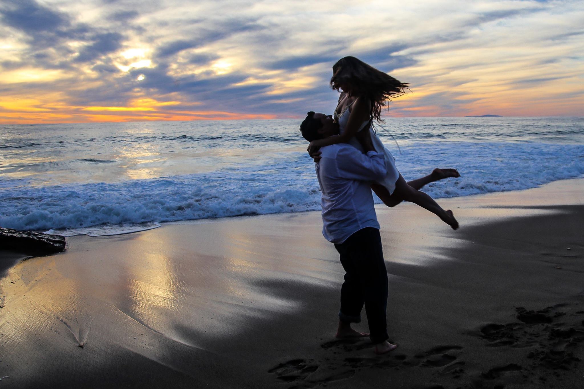
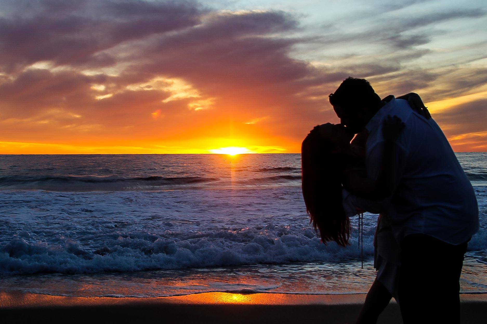
When the time came to begin sketching up ideas and creating a few mocks, I immediately had a vision of what was to be accomplished. My husband – a.k.a. client number two – had few requirements and overall told me to do my thing. Our friend and engagement photographer Danny shot the most stunning photographs at Point Dume beach in Malibu, CA. The vibes were on point and the weather was perfect. We all spent the day together as friends and he documented some surreal moments. Needless to say, he made the content portion of my design easy.
Photographs by Daniel Leist
The mood board was simple: a few hues of royal purple and gold, a modern art deco typeface, and simple accent graphics. This was singlehandedly the clearest I have ever seen a design in my mind and transpose it so perfectly into a tangible item. With our Save the Date cards, I was able to test out the palette and font combinations. They were timeless yet felt casual for a modern age. Being overjoyed with the results, the next design of the invitations were executed so quickly it left me feeling slightly bewildered. "It's never this easy," I remember thinking to myself.
Save the Date cards
Flying back from St. Louis to Los Angeles, I whipped out my laptop and zoned in. Two hours later I had my design. We made a single change and sent to print. My vision was one of a 5" x 7" landscape card with a gate fold. Guests would receive a royal purple envelope that had an incredible textured surface – immediately setting a tone. The most labor intensive DIY project was addressing each invitation by hand with gold ink. But damn if I, a typography aficionado, would have anything less than my hand calligraphy on my wedding invites! (Which sped up the impending tendinitis in my arm but we do it for our craft, right?) Each invitation was wrapped in gold ribbon and once the guest opened the two folds, the main text of our names, invitation script, and a full bleed photograph of us overlooking the Pacific Ocean would allude to our ceremony taking place on the beach.
Custom monogram with my favorite ampersand (Baskerville italic) in the history of ampersands
Most brides play with color swatches for flowers and table linens. I play in a Pantone world where those are the only swatches that matter. At this stage of the project, we were working with our friend Jose who was our printer. I'll never forget when he called and said the test run was ready for pickup and he couldn't' wait to show us. We drove down to Orange County and I held the mock in my hands, smiling down upon it as if it were my firstborn. The alignment and colors were perfect. Two weeks later we had our invitations and off they went via post.
Photograph by 3 Little Words
There is so much pride I have for this project because it came to life not only from my mind but with the involvement of my husband and our friends. It was nurtured and given such consideration and careful thought with each piece. Yet it was so natural and organic of a process. The passion to create this idea instead of chasing perfection led to my forever favorite print design.
It's easy for us designers to get hung up on an idea, a step in our process, trying to achieve the ultimate solution. What we need to remember to do is just listen to our intuition and keep in mind that these ideas and these visions we have are reasons as to why we are creatives and to roll with it. Stop thinking and just do.
Photograph by 3 Little Words
UI Exploration: Do the Technicolor Twist, Part 1
Working with brand guidelines can put a designer in a real funk when it comes to colors. We stick to what has been approved albeit our personal preferences. I personally have designed so many blue things I thought that I had seen the gamut of shades of blue but, nay! More were to be found. In the past year and a few months, I focussed solely on the color green with 17hats. (Green for positivity! money! success! more money!) Needless to say, I am now ready to work on projects that have NO GREEN!
Recently, a friend approached me with a UI project for his current endeavor: DropTrack. This product is a music marketing platform for musicians, djs, etc. to get their music into the hands of record labels, other artists, bloggers, and more. As someone who is a musician and music takes up 1/3 of life, I knew that this would be a fun opportunity. The original screens that were presented to me were laid out with an engineer's precision for functionality and ready to take on some designer TLC. I asked the owner, "How do you feel about adding in more color?" The response was, "Let's see it."
This post is presented as a Part 1 for a main reason: I am focussing on a few details at a time. The hope with this series is to display these UI elements to really showcase some of the detail work before featuring on the full screen UI.
My relationship with color in this product has been executed in phases. First was the whole page - how do I present an artists tracks elegantly? How can this product be an even better showcase for these artists? From there, color was used with all CTAs, messaging, alerts, tags. If it wasn't body text, it probably was assigned a nifty RGB value. It made the page come alive but in a functional way. Here are a few samples created thus far:
Dropdown with custom icons for download options.
Message modals. Success alert uses a non-traditional blue/green gradient that is upbeat but not overpowering. Error alert uses a burnt orange gradient versus a bright red to reduce reactionary stress for the user.
Payment modal. Uniting the CTA header text with CTA button with a fabulous purple.
This project is exciting in the fact that there is a great deal of creative freedom while respecting the product itself. The use of color can still allow for a sleek and modern look if done tastefully and correctly. There's always a reason behind a color selection which is why it is effective.
Stay tuned for Part 2 to see how the UI on this product develops.
Product Review: UI Stencils
As a designer who has an affinity towards pen and ink as primary tools of the trade, I always look to see what fun products are available to aid in UI and UX development. I came across UI Stencils while going on a slight binge to up my wireframing game.
A main component of my process as a UX designer is transferring any and all ideas onto paper. The sketches are my shorthand and allow me to communicate actions and flows faster than working on the computer (some may call this odd, I call this one of the wonders of Jen's designs). By fleshing out actions, gestures, questions, etc. via sketching, I am able to cut down on time spent on a series of digital wireframes that can sometimes lead to a collection of chaos. What I mean by that is artboards that go on forever and the idea you want to execute gets lost.
Enter UI stencils. They have thought of everything and I felt like Christmas came early when I browsed their product list. I went ham on adding items to my cart - stencils for iOS, Android, Web, gestures(!!!), a pixel ruler, and an every day carry kit (because everyone should have this in their pocket, am I right?). It didn't end there. Then began the addition of all the Sketch pads to pair with the stencil kits. Whoa!
iOS Stencil, iOS Sketch Pad, Pixel Ruler, Micron 0.5
My arsenal was full and ready to be used. I created incredibly detailed sketches that aided in my conversations with developers and stakeholders for feature development. Some of the developers had hearts in their eyes for some good old fashioned paper drawings stating, "this is why pen and paper should still be used." It felt like a huge win to me. With these wireframes, I accurately transferred the designs into PRD's and used them as the base for my digital wireframes. Process streamlined even more.
Yet with all the praises I have for these products come a few places for improvement. I found that many of the icons were just too large and felt like they would have been great back with older iOS guidelines for image sizes. Times have changed and we are no longer constrained to 44px! Icons were especially large when I used a fine pen such as 0.1 or 0.5, the sizes I comfortably use for sketching. Another wish list item would be horizontal lines for main UI components such as navigation tab bars, top bars, etc. While there is a small notch on the side to indicate where to draw the line, that secondary step could be eliminated by a simple thin line etched out. The last "please make this happen" item was a fuller notes section. I would love to be able to write out more notes alongside the devices. Yes, this would call for a larger sketchpad but SO WORTH IT in the long run.
Overall, everyone who encountered either the UI Stencils products or my sketches created using their products was incredibly pleased. It made sketching not just more fun but more accurate to tell a feature story even better.
Thanks UI Stencils for the stellar products!
Design is the Key to Help Your Business Stand Out
Earlier in the year I wrote this article to help stress the importance of design in businesses. Many entrepreneurs undervalue or even forget the benefits that design can have with a brand, product, and business.
Originally posted to the 17hats blog, read on to hear my tips about implementing killer and strategic design with your business.
Starting and running your own business is one thing, but when it comes to standing out from the pack of your peers and competitors, one crucial aspect can set you apart from the pack. No, it's not a perfected sales funnel or in-depth marketing strategy -- it's good design.
These days, we know you have precious few seconds to catch someone's attention and hold it. With smartphones buzzing, ads flashing by everywhere you look, and the hustle and bustle of modern living, how will your business make its mark? Not with boring design, that's for sure.
“Though often an afterthought for many a business owner, design plays an elemental role in the way potential (and current) clients perceive your brand.”
Subconsciously or even actively, the quality of your logo, business cards, website, or even physical product will be evaluated, and worth will be assigned to your business just based on how things look!
When faced with the challenge of design many business owners think, "well, I'm not a designer, I don't know what I'm doing." While that may be true, it doesn't need to remain that way.
Here are some surefire ways you can up your design yourself (or maybe even outsource some, if you need to).
Your Business Has a Story to Tell
One of the core aspects of design is being able to convey your message effectively via visual cues and themes.
What is your business’s story? What do you want your brand to say to the world?
Knowing what you want is the fundamental first step toward refining and unifying your business’s visual assets.
Once you have that solidified, conduct research on websites in your field, study marketing collateral, or even build a Pinterest board with things you like in order to build a collection of inspiration that resonates with you and your brand's core values.
Not sure where to start? Head over to Dribbble or Behance, two wonderful design communities that are sure to get your creative juices flowing.
Gathered a few ideas?
Don’t be afraid to ask friends or family for their opinion about the creative direction you’re wanting to explore for your business. Solicit feedback and conduct surveys: do your new look and feel represent the values behind the product or service you're trying to sell? Is the message clear and consistent?
“It’s important to look at both the pros and cons of design to fully understand what can be applied to your brand.”
When you have your messaging ready to go, you can then begin to translate that into a visual direction. This is extremely helpful for communicating to not only your audience but to anyone who may be producing the actual design materials!
Wave That Magic Mouse, and Bring Your Ideas to Life
A lot of people say, “I’m not creative, I can’t make the graphics myself.” This is so not true.
You thought up and started a business, didn't you? That's an incredibly complex and creative task. You clearly have problem-solving skills and now it's time to put them to work in a different capacity.
If you just need to get a grip on the basics, there are many free resources available to all skill levels. Enter Canva – a graphic design tool which allows you to create beautiful imagery with a very low learning curve.
Canva's drag and drop tool makes it easy to edit images, add type, and even format for proper social media sizes to beautify your images in no time. Canva is so easy to use that even those of you who look at design as a daunting task may have fun with it! What’s more, Canva has some great resources that aid in helping you learn the product and how to use the features to their full capacity.
If you’re feeling like you want more of a challenge, Photoshop does offer a 30-day free trial to get you started before making any type of financial commitment, plus a wonderful and huge community to look to for aid.
Don't Go it Alone
Not feeling up to the DIY method? There are many, many designers out in the world and no, they do not all cost as much as you think (without sacrificing quality).
“My advice to friends has always been to ask your network for a recommendation for a designer.”
Generally, there will be at least one person who can pass along a good candidate. Not only have you made the search easier for yourself, but you are gaining a resource that comes backed by an endorsement. That eases the vetting part of the hunt!
If your network is coming up dry, head over to Upwork (We've talked about them on the blog before), where you will find design freelancers available for hire, no matter the size of the job or budget.
What I really enjoy about Upwork is the transparency between the client and designer, since you'll be able to view the designer’s work in advance and read reviews from previous clients.
No matter the route you go in finding a candidate, here are a few tips for working with designers:
- Don’t be afraid to speak to more than one designer. See which potential hires can communicate with you effectively and are excited about working on your project. I can't stress the excitement enough; it is very important the person tasked with translating your idea into reality actually cares!
- Always view a designer's portfolio and receive a quote for potential services. Like any other person you work with, know what you are getting into before committing. Let their work speak for them more than what they like to express to you in an email. Remember, it’s what you can see versus what you can hear.
- Use the power of “No.” When working with a creative, it’s okay and encouraged to provide constructive feedback! Your designer is creating your ideas, not the other way around. Communicate effectively and provide feedback that will only help the designer achieve your desired goal. Us designers will not be offended if you express that the design is not on the right path – help us to get back on track!
Look at Your Beautiful Business Now
Now that you have decided on your business’s messaging and determined how to execute it, you are on the up with integrating a visual theme that will strengthen your brand recognition.
“It’s important to maintain quality and consistency of your business’s imagery, so make it a part of your process!”
Make sure that every new piece of collateral you produce has the same look and feel you've established so that your clients can come to expect consistency. To go one step further, have your designer build a mini style guide for you with color palettes, fonts, and any other imagery you'd likely be using again in the future.
With learning anything new, practice makes perfect. Keep working and iterating until you have designed collateral that you are happy with and that your business deserves.
Happy designing!

